CupertinoCheckbox
A macOS style checkbox. Checkbox allows to select one or more items from a group, or switch between two mutually exclusive options (checked or unchecked, on or off).
Examples
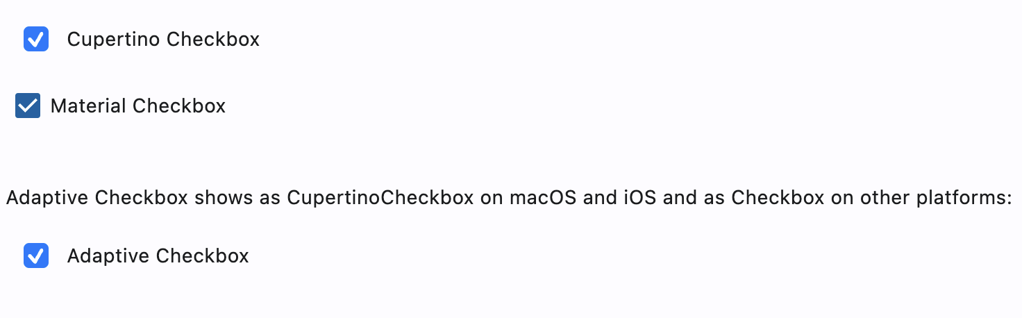
CupertinoCheckbox and adaptive CheckBox example
- Python
import flet as ft

def main(page: ft.Page):
    page.add(
        ft.CupertinoCheckbox(label="Cupertino Checkbox", value=True),
        ft.Checkbox(label="Material Checkbox", value=True),
        ft.Container(height=20),
        ft.Text(
            "Adaptive Checkbox shows as CupertinoCheckbox on macOS and iOS and as Checkbox on other platforms:"
        ),
        ft.Checkbox(adaptive=True, label="Adaptive Checkbox", value=True),
    )

ft.app(main)
Properties
autofocus
True if the control will be selected as the initial focus. If there is more than one control on a page with autofocus set, then the first one added to the page will get focus.
active_color
The color used to fill checkbox when it is checked/selected.
If fill_color returns a non-null color in the SELECTED state, it will be used instead of this color.
Defaults to Colors.PRIMARY.
border_side
Defines the checkbox's border sides in all or specific ControlState states.
The following states are supported: DEFAULT, PRESSED, SELECTED, HOVERED, FOCUSED, DISABLED and ERROR.
check_color
The color to use for the check icon when this checkbox is checked.
fill_color
The color used to fill the checkbox in all or specific ControlState states.
The following states are supported: DEFAULT, SELECTED, HOVERED, FOCUSED, and DISABLED.
active_color is used as fallback color when the checkbox is in the SELECTED state,
CupertinoColors.WHITE at 50% opacity is used as fallback color when the checkbox is in the DISABLED state, and CupertinoColors.WHITE otherwise.
focus_color
The color used for the checkbox's border shadow when it has the input focus.
label
The clickable label to display on the right of a checkbox.
label_position
Defines on which side of the checkbox the label should be shown.
Value is of type LabelPosition and defaults to RIGHT.
mouse_cursor
The cursor for a mouse pointer entering or hovering over this control.
Value is of type MouseCursor.
semantics_label
The semantic label for the checkbox that will be announced by screen readers.
This is announced by assistive technologies (e.g TalkBack/VoiceOver) and not shown on the UI.
shape
The shape of the checkbox.
Value is of type OutlinedBorder and defaults to RoundedRectangleBorder(radius=4).
tristate
If True the checkbox's value can be True, False, or None.
Checkbox displays a dash when its value is null.
value
Current value of the checkbox.
Events
on_blur
Fires when the control has lost focus.
on_change
Fires when the state of the Checkbox is changed.
on_focus
Fires when the control has received focus.